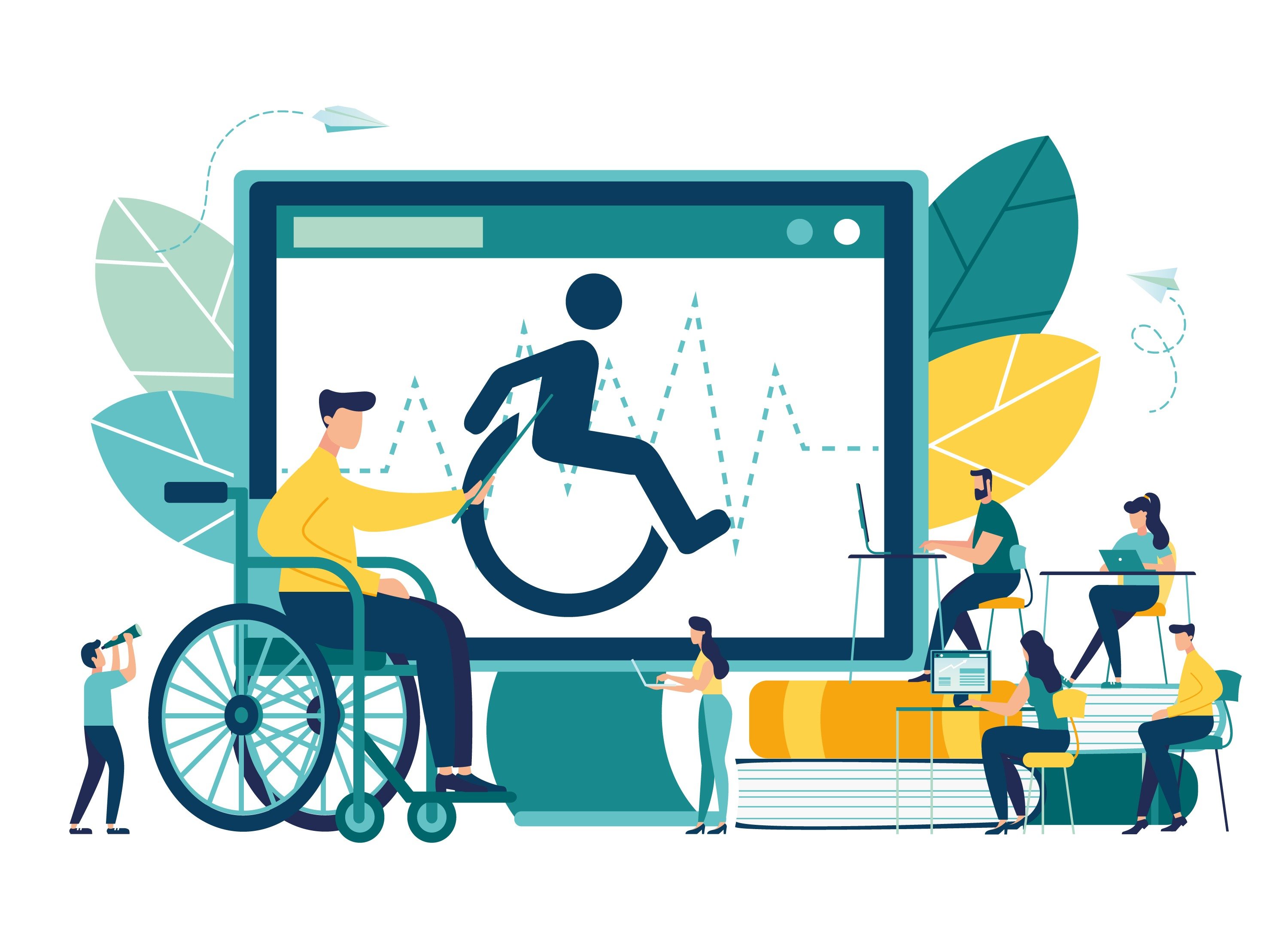
In today's digitally advanced world, designing for accessibility has become the norm. Brands that aren't using an accessibility-first design run the risk of losing leads and prospective customers to competitors that do.
Digital accessibility involves designing websites, building applications and creating content that can be used by virtually everyone, including those with cognitive, speech, auditory, motor or visual disabilities. There are more than 1 billion people in the world with a disability, including 56 million (1-in-5 citizens) in the United States.
One of the perceived challenges of designing for accessibility is the myth that it's difficult and expensive. Brands that make accessibility a priority when creating products and designing their websites don't need to spend more or expend additional effort. However, fixing an inaccessible site will require some time and resources.
Designing for accessibility
In 2018, 2,250 website accessibility lawsuits were filed in U.S. state and federal courts. Aside from the consequences of not designing websites with accessibility in mind, multiple studies show that accessible websites have better usability, reach a much larger audience, are more SEO-friendly and have better search results.
Designing for accessibility delivers a better user experience to everyone regardless of situation, context or ability. To ensure better usability and improve UX scores, here are some tips and best practices for brands looking to incorporate accessibility-first design in their products and websites.
Understanding color contrast
Poor color contrast remains one of the most overlooked web accessibility problems. The World Health Organization (WHO) estimates that there are 217 million persons with moderate to severe vision impairment. Individuals with poor vision often find it difficult to read text from backgrounds with low contrast.
Ensuring that there is sufficient contrast between backgrounds and text helps improve your website's accessibility. The W3C recommends at least a 4.5-to-1 contrast ratio between text and its underlying background. This value decreases when using heavier and larger fonts. The minimum recommended contrast ratio when using at least a 14 point bold font or 18 point font is 3-to-1.
Using multiple visual cues
Brands shouldn't use color as the only visual cue when trying to communicate important information, prompt a response or indicate the next action to take. Individuals with color blindness or low visual acuity may find it difficult to follow such visual cues. Studies show that color blindness affects roughly 1 in 12 men and 1 in 200 women worldwide.
Using indicators such as patterns or text labels is a better option when designing for accessibility. Underlining text or increasing font weight can be used to make linked text within a paragraph stand out while adding an icon or title to an error message will make it more readable.
Multiple visual cues become even more important when showcasing elements that contain complex information, such as graphs and charts. Rather than using color, brands can communicate disparate information by using other visual cues, including size, labels and shape.
Proper use of effects and animation
While effects and animation can help bring your page and brand to life, they can be distracting and potentially deadly to some users. When photosensitive users are exposed to high-intensity or fast-flashing effects and patterns, they can become dizzy or nauseous or undergo seizures known as "photosensitive epilepsy."
Constant motion or animation on web pages can be distracting to most users, especially those who have difficulty concentrating. The human eye is drawn towards movement and anything that moves constantly can easily become a source of distraction. Brands should design safer animations and use slow-moving effects as much as possible.
Accessibility-first video content
Embedded videos should come with subtitles and/or transcripts so users can consume the content in a way they desire. Site visitors with visual impairment or hypersensitivity to light may prefer to read while those who are unable or unwilling to listen to the video will require subtitles.
Designers should also note that auto-playing videos can be annoying. Such videos can be a source of distraction and will force users to scan the entire page looking for the offending media.
Supporting keyboard navigation
Keyboard accessibility is a key aspect of web accessibility. Users that depend on screen readers and individuals with motor disabilities rely on keyboards to navigate content. Such users typically use the Tab key to navigate through interactive elements on web pages, such as input fields, buttons and links.
Adding a visual indicator to describe a currently selected component can improve the accessibility of your site. It's also a good idea to arrange the order of interactive elements in a way that's intuitive and logical. This means placing the more important elements to the top and as far to the left as possible. The visual flow should go from left to right and top to bottom.
Audit to see if you meet WCAG standards
Understanding your users and being inclusive to their needs is the key to crafting better and more accessible experiences. Accessibility is solved at the design stage and it is at this point that you should recognize of the needs of your target users as well as those with disabilities and others outside your target demographic.
It's recommended that you conduct an accessibility audit to find out if your website or product meets Web Content Accessibility Guidelines (WCAG) 2.1 standards and works with assistive technologies, including screen readers, speech recognition tools and screen magnifiers. WCAG 2.1, published in June 2018, is backwards compatible with the more popular WCAG 2.0 standard and contains 17 additional success criteria
The audit results can help pinpoint accessibility issues and identify areas that require improvements. Ensure that your website and products can be used by everyone regardless of geographic location, education, age, economic situation or ability.